
::: Berlin / Germany :::
Mobile Layouts & Web Design
Whilst working for one of Germany's biggest multimedia publisher, the Axel Springer AG, I had the chance to be part of a layout team which focused on editing the well-known newspaper BILD's daily print content for their digital newspaper-app version. Furthermore I joined the new media business team of the publishing house and turned a new business idea into reality by redesigning valued clients' business webpages.

BILD iPad news-application
The daily newspaper content is presented interactively on a touch-
screen (left side) . The topics are tapped on to reveal the content
subpages (bottom), with longer texts scrolling interactively and
pictures of the print version in an In-App photogallery (as well as
links to other online content such as videos).


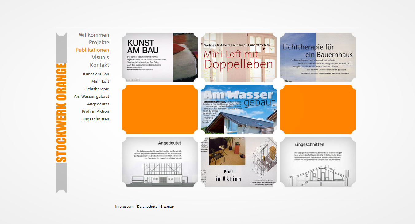


Architects of STOCKWERK ORANGE
STOCKWERK ORANGE's business card, in the shape of a 1920's Berlin tram ticket (a vertical square with dotted perforation of each of the shorter sides), conduced as
leading inspiration and was used as an abstract key visual for the re-launch of the architects brand new portfolio webpage, early 2015. www.stockwerk-orange.de
::: Berlin / Germany :::
Viral Marketing & Advertising Prints
In one of Berlin's bigger advertising agencies, HEIMAT Berlin, I was part of a layout team which worked closely with storyboarders, film crews and photographers in order to launch a new advertising campaign starting with a unique viral short film, focusing on representing the clients' image in a more appealing manner.
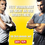
McFit 'never give up'
The biggest 'budget' fitness studio chain in Germany, McFit, landed a testimonial contract with two of Germany's most famous boxing champions 'The
Klitschko's'.
The catch phrase for the new viral ad and following ad campaign was 'never give up' and I was in charge of the printed ad's layout after the short
film clip went online.


Hornbach ad prints
The Hornbach hardware store is one of the most famous hardware suppliers in Germany because of their experimental methods of running 'standart ads'. Following this
short film, booklets about the making of the film were given to every store employee across Europe. The layout team of
HEIMAT was in charge of releasing posters for new stores.

::: Berlin / Germany :::
Bachelor & University
While completing my degree in multimedia design at the University of Art and Design, Berliner Technische Kunsthochschule (www.btk-fh.de/en), I managed several multimedia projects. The best of my graphic works can be found here.

Bachelor thesis: wearable.Protest
The idea behind my Bachelor project was a 'wearable protest'. My T-shirts display and support different kinds of charity projects which get revealed after the
purchase of a green, blue or brown shirt (the CI colours of the charity organisation www.en.reset.org) by the decryption of a digital code. Scanning the code
with a tablet app brings the graphics to life and makes the viewer aware of a specific charity project through the animations. The hand drawn illustrations juxtapose the visual effects of the
animations and the use of the digital codes.
The purpose of the blue shirts is to raise awareness of young Muslim girls protesting against the military supremacy in Afghanistan through their skate boarding school 'Skateistan e.V.'. The
graffiti surrounding the main images is reminiscent of a wall mural and puts the serious atmosphere of daily violence into juvenile surroundings.
The purpose of the green shirt is to acknoledge the beauty of the Khmer culture in Cambodia and to raise donations for a crew of medical supporters volunteering on a boat clinic, offering free
health care for the isolated residents in the floating villages of the biggest lake in South East Asia, Tonle Sap.
The purpose of the brown shirt is to demonstrate the transformation of the traditional African cultures into modern digital societies by presenting the African wild countryside on a digital
pixel. The biggest career opportunities for African youth nowadays involves literacy in digital technology.


MOLOTOW graffiti art supplier
The usual representation of an air brush and graffiti art supplies magazine is bold, colourful and juvenile. I reduced the boldness aiming for a clean, photo-graphic magazine look showing that graffitis are beyond vandalism and the tools used are tools of artists.


FIFA World Cup 2010
During the FIFA World Cup I created eleven different air brush stencil designs reaching from football themes to African wildlife to represent the eleven football players of the South African national team as part of a university project. The temporary air brush images on the football are captured in the short motion clip.


German Egypt Association
Accepting cultural differences by focusing on similarities of German and Egyptian culture was the intention of these three advertising photography prints. They highlight the culture ('tea ceremony', left), the wisdom ('sand of time', middle) and the
arts ('paint', right).

Arcadia typeface brochure
To understand and represent one of the famous Neville Brody fonts called Arcadia I focused on the aspect of Brody's history as rebel typographer and used the font 'on my skin' as representation
of London's punk rock and tattoo scene.


